Home Assistant Dashboard Setup: A No-YAML Guide
How to set up a Home Assistant dashboard that actually looks good - Lovelace visual editor, useful cards, organising views, and themes. No YAML required.
A good Home Assistant dashboard setup turns a wall of obscure entity names into something a non-technical housemate can actually use. The default dashboard, helpfully, is not that - it auto-generates a single page with every device dumped into the same view, and it can feel like staring at a server admin panel.
The good news is that modern Home Assistant ships with a perfectly capable visual dashboard editor (Lovelace), and you can build a clean, attractive dashboard without writing a single line of YAML. This guide walks through the no-YAML approach end to end: planning your views, choosing the right cards, organising for daily use, applying themes, and making it work on a phone.
If you have not yet installed Home Assistant, start with our getting started with Home Assistant guide and the Home Assistant on a Raspberry Pi setup walkthrough. Come back here once you have a few devices added and the auto-generated dashboard is feeling cluttered.
Why does the default Home Assistant dashboard fall short?
Auto-generated is functional but not usable
When you first install Home Assistant, the system creates a default dashboard called "Overview" by scanning every entity it finds. The result is a long, undifferentiated list of switches, sensors, and devices - useful for confirming things are connected, useless for daily life.
The specific problems are predictable:
- No grouping. Living room lights sit next to bedroom temperature sensors, which sit next to system uptime metrics. There is no narrative.
- Too much information. Every entity is shown, including dozens of diagnostic sensors you will never look at (battery levels for batteries that do not exist, link quality readings, last-seen timestamps).
- No hierarchy. Everything is the same size and visual weight. Nothing draws your eye to what actually matters right now ("is the front door locked?").
- Not phone-friendly. The auto-layout works on a desktop screen but creates a wall of text on a phone, which is where most people actually use Home Assistant day to day.
The goal of building a custom dashboard is not to look pretty for its own sake - it is to surface the few things you genuinely need at a glance and hide everything else behind clearly labelled views.
How to build a Home Assistant dashboard
Plan before you build
Decide what the dashboard needs to answer at a glance - typically four questions: what's on, what's wrong, what's the weather, and what's coming up. Five minutes of planning saves an hour of rearranging.
Open the visual editor
Three-dot menu (top right) → Edit dashboard. Take over the auto-generated dashboard so your changes persist across restarts.
Add the cards that do the heavy lifting
Six built-in cards cover 90% of typical use: Entities, Glance, Picture-Elements, Weather Forecast, Conditional, and Vertical Stack. Add them via Add Card → search.
Organise views around daily use
Each view is a separate tab. Group cards by room or by daily flow (Morning / Evening / Away) rather than by entity domain. Use icons for views to make the mobile tab bar usable.
Apply a theme
Profile → Themes. Install a community theme like 'Graphite' or 'iOS Themes' via HACS, then pick it as your default. Two minutes of work for the biggest visual payoff.
Make it work on the phone
Open the dashboard in the Home Assistant Companion App and check that the layout stacks cleanly. Move long Glance cards to a phone-only conditional view if needed.
Why should you plan before you build?
Five minutes of planning saves an hour of rearranging
Before opening the dashboard editor, decide what you actually want to see. The most useful dashboards answer four questions immediately:
- What is happening right now? Which lights are on, what the temperature is, whether anyone is home.
- What needs my attention? A door left open, a low battery, a tumble dryer that just finished.
- What might I want to change? Common controls - turn off the living room lights, set a scene, adjust the thermostat.
- What is wrong? Unavailable devices, failed automations, anything red.
A simple structure that works for most homes:
- Home view - at-a-glance status and the 6-10 controls you use every day
- Rooms view - one tab per room with all that room's controls
- Energy view - power, gas, solar if you have any
- Security view - locks, cameras, alarm, presence
- Settings view - system status, automations, anything maintenance-related
Sketch this on paper or in a notes app. Decide which entities live where. Pick the 8 or so things you want on the home view. Then open the editor.
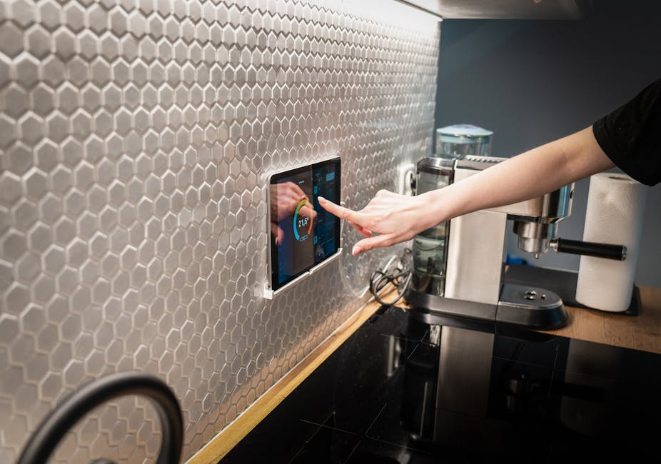
How do you open the visual editor?
Where the no-YAML magic happens
Home Assistant's dashboard editor lives behind the three-dot menu in the top right of any dashboard. Click Edit dashboard and the interface switches into edit mode - every card gains a small pencil icon, and a floating + button appears at the bottom of the screen.
A few important settings to know about up front:
- Take control. The first time you edit the auto-generated dashboard, Home Assistant will ask whether you want to take control. Say yes - this stops the system regenerating your dashboard every time a new device is added, which would otherwise overwrite your work.
- Sections vs masonry. When creating a new view, you choose between layouts. The newer Sections layout is the easiest to use visually - it lets you group cards in named sections that flow nicely on different screen sizes. The classic Masonry layout is the older default.
- Visibility. Each view has a visibility setting that lets you hide it from specific users (so your guest user does not see the technical settings view, for example).
- Icon and title. Every view gets an icon (any Material Design icon name like
mdi:homeormdi:lightbulb) and a title that appears in the navigation bar.
From here, every dashboard change you make is a few clicks rather than a YAML edit. If you accidentally change something you cannot recover from, the Raw editor under the same three-dot menu shows the underlying configuration - but for everything in this guide, the visual editor is enough.
Which cards do most of the work?
Six built-in cards cover 90% of what you need
Home Assistant ships with around two dozen built-in card types. You do not need most of them. The following six handle the majority of any sensible dashboard.
Tile card
The Tile card is the modern default and is what you should reach for first. Each tile shows one entity: an icon, a name, the current state, and an optional secondary line (like the last-changed time). Tap the tile to toggle, long-press to see more controls.
Tile cards work for almost everything: lights, switches, locks, sensors, climate devices, media players. They scale beautifully on phones because each tile is a clean, finger-friendly target. Use them as the workhorse.
Entities card
The classic vertical list. Each row is one entity with its name, state, and a small control. It is denser than tiles - you can fit 8-10 entities in the same vertical space as 4 tiles - which makes it good for things you want to glance at but rarely tap (battery levels, system metrics, sensor readings).
Use the Entities card for any "long list" use case: all the windows in the house, all the door sensors, all the temperature readings.
Glance card
Glance is a horizontal strip of entities, each shown as a small icon with the current state below. It packs a lot of information into a thin row.
This is ideal for status overviews: "are the four most important doors locked?" as a single row of four icons, or "are the kitchen appliances on?" as another. Tap any icon to drill in, see the same row at a glance the rest of the time.
Picture Glance card
The same idea as Glance, but with a photo as the background and the entity icons overlaid on top. Use this for cameras (live snapshot with the door lock, motion sensor, and front porch light overlaid as quick controls) or as a friendly "room" header (a photo of the living room with the lamps and TV as overlay icons).
History Graph, a Home Assistant card type that displays historical sensor data over time, card
A simple line graph showing the recent history of one or more sensors. Excellent for temperature, humidity, energy use, and anything else that varies over time. Pick the entities, choose the time window (six hours, a day, a week), done.
Markdown card
A plain text card that supports Markdown formatting and template substitution. Use it for headings inside a section, brief instructions, or computed messages ("There are {{ states.binary_sensor.window_open | selectattr('state','eq','on') | list | length }} windows currently open").
A dashboard built mostly from Tile, Entities, Glance, and the occasional History Graph or Markdown card looks clean, loads fast, and works on every device.
How should you organise views around daily use?
How real people actually navigate the app
The single biggest improvement you can make to a Home Assistant dashboard is using views properly. Each view is a separate tab in the navigation bar. Most users never get past the default "Overview" tab.
A workable structure for a typical home:
Home tab - The first thing you see. Show: lights currently on (with quick toggles), front door lock status, current indoor temperature, who is home, the next calendar event. Around 8-12 entities total. The principle is: if you tap the app and you do not need any of the other tabs, this view should already have answered your question.
Rooms tab - One section per room (using the Sections layout). Each section shows the lights, climate, sensors, and controls for that room. This is your "I want to do something specific in the kitchen" view.
Energy tab - Total household power use, your solar generation if you have any, top consuming devices, history graphs. Home Assistant's built-in Energy dashboard does most of this if you configure it.
Cameras tab - Live snapshots from each camera, recent motion clips. Picture Glance cards work brilliantly here.
Settings tab - System status, integration health, recent automations triggered, low batteries. Hide this from your housemate user account so it does not clutter the main interface.
More than 5-6 tabs starts to feel cluttered. If you find yourself wanting more, that is usually a sign that some tabs are doing too much work - split a busy "Rooms" view into separate views per floor of the house, for example.
How do you apply a theme?
Two-minute change with the biggest visual payoff
Out of the box, Home Assistant uses its default light and dark themes, which are perfectly competent but a bit grey. Switching themes is one of the easiest visual upgrades you can make.
The simplest no-extras-required option is to change the colour scheme used by the default theme. Open Profile (bottom of the sidebar), and you can pick from the built-in themes including system-light, system-dark, and a couple of accented variants.
For more variety, install one of the popular community themes via HACS (the Home Assistant Community Store) - for example Mushroom themes or iOS themes. These add a much wider palette including thoughtfully designed dark themes, accent colour variants, and themes specifically designed to read well on tablets used as wall-mounted dashboards.
If you do not want to install HACS yet, the built-in themes are a good starting point. Pick one, live with it for a week, then decide if you want to explore further. Many people find the default dark theme is genuinely the most readable - particularly on a wall-mounted tablet that runs all day.
How do you make the dashboard work on a phone?
Most people use Home Assistant primarily on mobile
It is easy to design a dashboard on your laptop and then realise it is unusable on the phone where you actually live. A few tactics specifically for the mobile experience:
- Test as you go. After every meaningful change, open the Home Assistant companion app on your phone and look at the same dashboard. Things that look fine on a 1440px desktop screen often need adjustment for a 375px phone screen.
- Prefer Tile cards over Entities lists. Tiles stack into a clean grid on mobile (typically 2 columns). Long Entities lists become walls of small text that are hard to scan and harder to tap.
- Limit the home view to one screen. On a phone, the home view should fit roughly within the first scroll. If you have to scroll three times to see all your "essential" controls, you have too many.
- Pin the companion app dashboard. In the Home Assistant companion app on iOS and Android, you can set which dashboard opens by default and even pin a different dashboard to the home screen as a separate icon. Most people set their main dashboard as the default opening view, then create a smaller "Quick controls" dashboard that lives on the phone home screen.
- Use the Sections layout. It is the only layout that adapts column counts to screen width sensibly. On a 1440px desktop you might see 3-4 sections side by side. On a phone the same dashboard collapses to one column without you doing anything.
Mobile-first is genuinely the right mindset for most home dashboards. The desktop view is a bonus, not the primary surface.
What optional next steps unlock with HACS?
When you outgrow the built-in cards
If you exhaust what the built-in cards can do, the community has built dozens of additional cards installable via HACS (Home Assistant Community Store). HACS is itself a separate integration, and installing it is well-documented but does require a small amount of setup.
The community cards most people install first:
- Mushroom - a family of beautifully designed cards (Light, Climate, Cover, Person, Title) that look polished out of the box. Mushroom is what most of the prettiest dashboards you see online use.
- Mini Graph Card - a cleaner-looking history graph than the built-in option, with smoother curves and configurable colours.
- Auto-Entities - automatically populates a card with all entities matching a filter ("all lights that are currently on", "all sensors with low battery"). Eliminates a huge category of manual list maintenance.
- Card-mod - lets you tweak the styling of any built-in card without writing full custom cards. Good for fixing one or two visual annoyances rather than replacing the whole card.
- Button Card - a hugely flexible card that can replicate almost any visual design with enough configuration. Powerful but has a steep learning curve.
A reasonable progression is: build a working dashboard with built-in cards first, live with it for a few weeks, then identify the specific frustrations that community cards could solve. Installing every popular card before you know what problem you are solving is a common time sink.
Which mistakes should you avoid?
What we see go wrong most often
What we liked
- Start with one well-designed home view and one rooms view - add more tabs only as you find them necessary
- Pick the Sections layout for new views - it adapts to screen width without configuration
- Use Tile cards as the default for anything you might want to interact with
- Sketch the structure on paper before opening the editor - saves hours of rearranging
- Test every change on your phone immediately, not after you finish
- Take control of the auto-generated dashboard early so future device additions do not overwrite your work
- Hide diagnostic and maintenance views from non-technical user accounts
Watch out for
- Trying to put every entity on the dashboard - most diagnostic sensors should never be visible
- Designing on desktop and never testing on a phone - the most-used surface gets the worst layout
- Installing every popular HACS card before you have a clear problem to solve
- Using YAML mode for changes you could make in the visual editor - slower and harder to undo
- Building one giant 'Overview' view with 50 cards instead of splitting into focused tabs
- Forgetting to set the dashboard as the default in the companion app - guests and family will see the auto-generated mess
- Choosing a theme that looks great on the laptop but is unreadable on the wall-mounted tablet
What does a 30-minute starter dashboard look like?
If you just want to follow steps
If you want a concrete starting point, here is a build sequence that produces a working dashboard in about half an hour, assuming you already have Home Assistant installed and a handful of devices added.
- Open the dashboard editor. Three-dot menu, Edit dashboard, take control when prompted.
- Delete the default view. It is overwhelming and you will not miss it.
- Create a Home view. Use the Sections layout. Title it "Home" with the
mdi:homeicon. - Add a Tile card for each light you regularly control. Group them in a section called "Lights".
- Add a Glance card for the doors you want to monitor (front door, back door, garage). Put it in a section called "Doors".
- Add a Tile card for your thermostat. Put it in a section called "Climate" along with a History Graph showing today's indoor temperature.
- Add a Markdown card at the top with a friendly message or the current time.
- Create a Rooms view. Use the Sections layout again. Add one section per room. In each section, add Tile cards for the lights, switches, and climate devices in that room.
- Test on your phone. Open the companion app, navigate through both views. Adjust anything that looks cramped.
- Done. You now have a working dashboard that beats the auto-generated default by a huge margin.
From here, expand based on what you actually find yourself wanting to see. Adding cards is fast once the structure exists.
What's next?
A dashboard is never finished
The best Home Assistant dashboards evolve over weeks. You add a card, live with it, find it useful, keep it. Or you find you never look at it, delete it, free up the space. The visual editor makes this iteration genuinely fast - there is no excuse to leave a frustrating layout in place because "YAML is too much faff".
The two principles that separate good dashboards from cluttered ones are: show only what you actually need at a glance, and test it on the device where you actually use it. Everything else - themes, custom cards, fancy animations - is decoration.
If you have not added any Home Assistant automations yet, that is the natural next step once your dashboard is comfortable. Automations turn the dashboard from a remote control into a system that mostly runs itself, and you should not need to look at the dashboard at all most of the time. That is the goal.